
With its gentle take on terracotta, Pantone’s Mocha Mousse is actually perfect for more traditional beachside homes. Still, we can’t help but imagine which hues the Institute would choose if designing for contemporary interiors along the coast. From Backdrop’s Blue is the Coolest Color to Piet Boon’s Mud to Behr’s Ocean Abyss, below are fifteen of our picks for Pantone Color of the Year 2025. While we have nothing against the earthy hue Pantone selected this year, the following colors are much better suited to today’s spaces.
Pantone Color of the Year 2025: PANTONE 17-1230 Mocha Mousse

While it might not be our favorite, designers have praised Pantone’s Color of the Year for 2025—Mocha Mousse (PANTONE 17-1230)—for its warmth, versatility, and grounding qualities. With its subtle elegance and call to the natural world, this rich, earthy brown has resonated across industries. From fashion and beauty to interior design and consumer goods, many see it as a reflection of the global desire for comfort and coziness.
It is both timeless and of the moment. Indeed, Real Simple’s Morgon Noll notes that the Institute chose their 2025 color with “‘sensorial warmth’ and ‘thoughtful indulgence’ in mind, and it was, in part, inspired by a viral TikTok trend.”
Designers are celebrating its adaptability with natural materials and muted palettes, while brands are already incorporating it into products ranging from home décor to kitchen appliances. While some would have certainly preferred more vibrant hues like Mapped Blue and Purple Basil, the general reception has been positive. This versatile shade is an unpretentious classic, as at home in contemporary interiors as it is in 17th-century pieds-à-terre.
Past Pantone Colors of the Year
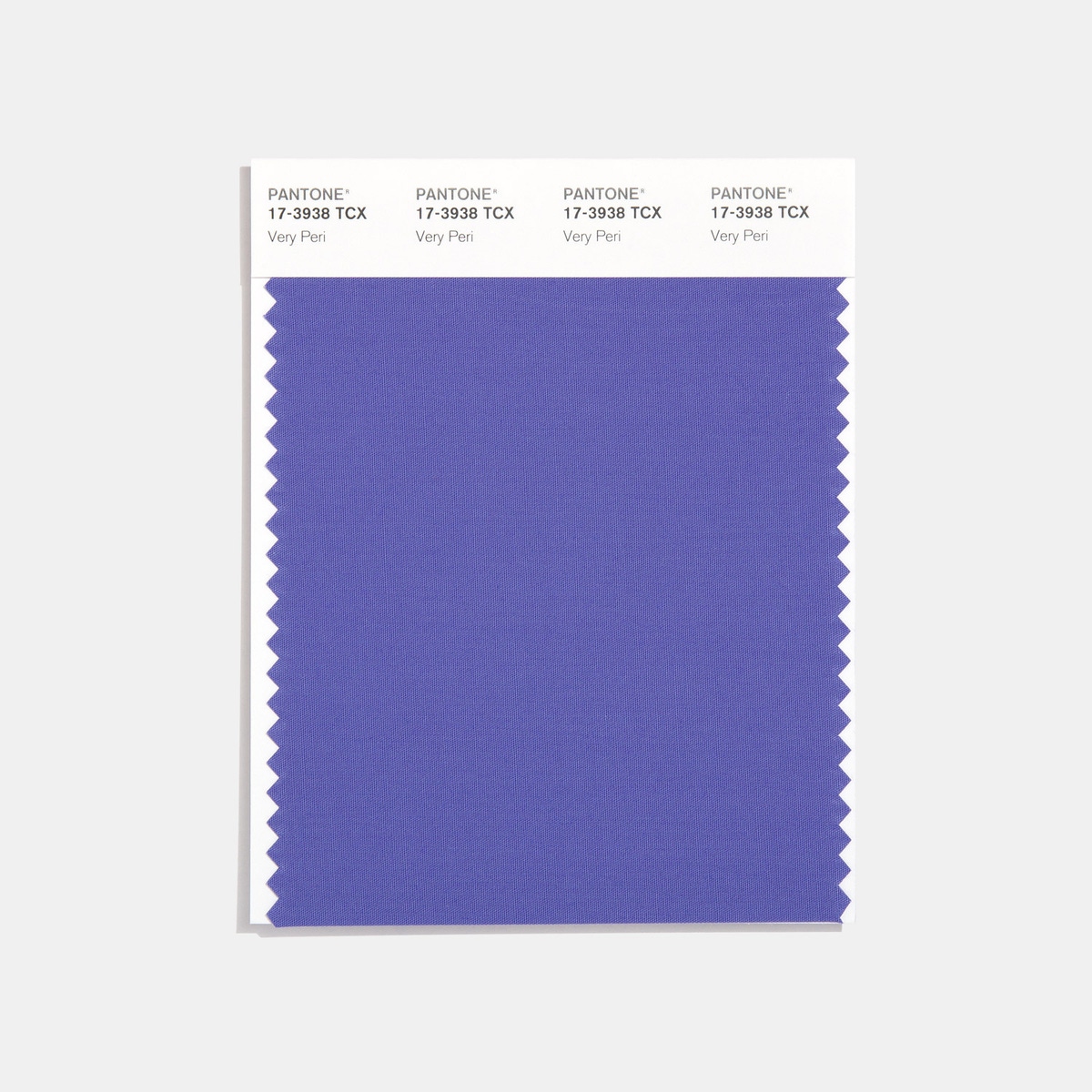
Pantone’s Colors of the Year often reflect cultural shifts and design trends. For example, Viva Magenta (2023) symbolized strength and optimism in a post-pandemic world. Pictured above, Very Peri (2022) captured a time of transformation and innovation, though its cooler tones divided opinions in interior design.
Classic Blue (2020) provided a sense of reliability and peace during a period of global uncertainty for all of us during the pandemic. Greenery (2017) offered us a visual reset and much-needed connection to nature, although its neon brightness posed challenges in everyday design. Each color reflects a broader cultural narrative but always sparks debates about its application and relevance.
15 Coastal Colors That Outshine Pantone’s Pick for 2025
Blue is the Coolest Color by Backdrop
A rich, luminous cerulean blue that feels vibrant yet timeless, Blue is the Coolest Color from Backdrop is our first replacement for Pantone Color of the Year 2025. To us, it evokes the brilliance of a clear coastal sky or the striking depths of the ocean, which makes it ideal for contemporary coastal interiors.
This blue is a statement-maker that creates a clean, modern look while remaining rooted in the natural beauty of seaside settings. Its versatility means that you can use Blue is the Coolest Color for an accent wall or pair it seamlessly with neutral palettes and natural materials like white oak or rattan.
The powder room above shows a wood-paneled wall drenched in a similar luminous blue hue, complemented by a custom enameled white vanity and a vintage Massimo Vignelli glass pendant light. The vibrant shade brings depth and drama to the space, while crisp white accents and minimal décor maintain a polished, modern aesthetic perfect for your refined coastal home.
Summer Blue by Benjamin Moore
A soft, breezy blue with gray undertones, Summer Blue by Benjamin Moore feels fresh yet understated. This versatile hue is reminiscent of clear skies over calm waters.
Summer Blue is an elegant choice for adding a touch of color without overwhelming your space. Its muted tone pairs beautifully with natural wood and clean architectural lines. We love it for creating a coastal feel that’s both modern and timeless.
In the contemporary hallway pictured above, a similar shade of soft blue graces the doorway to the right. It adds a quiet touch of serenity to the bold, geometric staircase, black accent wall, and sculptural accents. This subtle application of color creates a harmonious balance between the architectural drama of the space and the calming essence of coastal living.
Borrowed Light by Farrow & Ball
A soft, ethereal blue with a subtle green undertone, Borrowed Light by Farrow & Ball evokes the delicate quality of light reflecting off coastal waters. Its soothing hue is perfect for creating airy, tranquil interiors that feel effortlessly elegant.
This pale blue shade brings a serene, breezy vibe to any space, making it ideal for contemporary coastal homes. It pairs beautifully with polished chrome, natural marble, and soft white accents.
The bathroom above features a similar whisper-soft blue on its plaster walls, balanced by striking burgundy marble and modern chrome fixtures. The contrast between the airy wall color and the dramatic vanity adds a sophisticated edge, while the blue-and-white checkered tiles subtly reinforce the coastal charm we all love. This harmonious palette creates a fresh, polished look that’s both contemporary and timeless.
Whipped Mocha by Benjamin Moore
This might be similar to the Pantone Color of the Year 2025, but we love it anyway! Whipped Mocha by Benjamin Moore is a soft, warm taupe with subtle beige undertones. This elegant neutral exudes a sense of earthy refinement, understated luxury, and coziness.
A bit unexpected, this hue creates a serene and sophisticated backdrop that’s perfect for layering with natural textures like linen, wood, and woven accents. Its warmth brings depth to minimalist spaces while complementing the earthy tones often found in coastal designs.
The bedroom above shows a similar soft taupe on the walls that creates a calming, tonal palette. The textural details of the ribbed accent wall, the stone console, and the neutral furnishings enhance the room’s serene ambiance. This palette is ideal for creating tranquil guest suites or cozy, sophisticated living spaces in coastal homes.
Super Moon Pure White by Backdrop
Super Moon by Backdrop is a crisp, luminous white that feels clean and modern while exuding warmth. Its versatility makes it ideal for contemporary coastal interiors. Indeed, a sharp, neutral white reflects light beautifully and pairing seamlessly with natural textures like stone, wood, and linen. It enhances the airy, minimalist aesthetic that defines high-end coastal living.
The contemporary home pictured above features a similar bright white that frames the natural wood accents and rugged stone landscape. The sharp contrast between the pristine walls and organic elements creates a striking, serene design that feels perfectly at home in a coastal environment.
Mud by Piet Boon
Mud by Piet Boon is a rich, smoky brown with a grounded, earthy quality. Its depth and warmth make it a perfect choice for contemporary coastal spaces. This adds a subtle sophistication while remaining effortlessly versatile. The tone pairs beautifully with natural wood, stone, and soft neutral furnishings. It creates a cohesive and calming aesthetic.
The outdoor dining area pictured above features a similar deep brown as a dramatic yet serene backdrop. This frames the light oak furniture and sculptural accents beautifully. The balance between the dark wall color and natural materials brings a sense of understated elegance. This makes it an ideal choice for a refined coastal retreat.
Ocean Abyss by Behr
Ocean Abyss by Behr is a deep, moody teal with a richness that evokes the mysterious depths of the ocean. Its bold, saturated tone adds drama to contemporary coastal interiors, which makes it both versatile and impactful. This rich hue pairs beautifully with warm woods and neutral accents.
The interior pictured above features a similar deep teal as a framing element for the wood-clad walls and cabinetry, which creates a bold contrast while highlighting the architectural details. The rich hue enhances the natural textures of the wood, which is what we all want in an organic seaside home.
Dress Blues by Sherwin Williams
Dress Blues by Sherwin Williams is a deep, dramatic navy that adds richness and sophistication to any space. Its timeless quality makes it perfect for coastal interiors. This creates an elegant and moody atmosphere that pairs well with soft neutrals and metallic accents.
The living room pictured above showcases a similar navy hue enveloping the walls and trim. This frames the architectural details beautifully, such as the coffered ceiling and arched fireplace. The pairing of dark walls with bold brass lighting and plush navy furnishings enhances the room’s sense of refinement and creates a striking coastal retreat.
Giallo by Little Greene
Giallo by Little Greene is a bright, sunny yellow that radiates warmth and energy. Its cheerful tone makes it an excellent accent color for contemporary spaces. This brings vibrancy and bold personality to coastal interiors while maintaining a sophisticated edge.
The entryway pictured above features a similar vivid yellow on the stairwell. This highlights the geometric forms of the perforated staircase and creates a glowing backdrop for natural light. The bright tone contrasts beautifully with the neutral walls, resulting in a modern, uplifting focal point for the home.
Dust Lime Plaster by Piet Boon
Dust Lime Plaster by Piet Boon is a soft, neutral gray with subtle warmth. Its understated tone adds quiet elegance to contemporary interiors. This creates a seamless backdrop that pairs beautifully with natural stone, wood finishes, and muted palettes.
The hallway to the kitchen above uses a similar warm gray on the walls. This enhances the clean lines of the architecture and complements the natural materials in the cabinetry and flooring. The soft plaster finish adds texture and depth, making the space feel sophisticated and serene.
Atomic Red by Little Greene
Atomic Red by Little Greene is a bold, vibrant red with a warm orange undertone. This powerful hue adds energy and sophistication to contemporary spaces. Reminiscent of the fiery hues of a sunset over the Pacific Ocean, it works beautifully as an accent.
The exterior entryway pictured above features a similar fiery red—framing the passage and contrasting dramatically with the surrounding neutral tones. This bold application enhances the modern geometric forms of the architecture and creates a commanding, memorable first impression.
Nightingale by Benjamin Moore
Nightingale by Benjamin Moore is a soft, smoky taupe with a warm undertone. This versatile neutral adds depth and elegance to coastal interiors. Reminding us of the sand on the beach, it pairs seamlessly with natural materials like wood and stone.
The living room pictured above uses a similar warm taupe to frame the large windows and blend with the natural wood ceiling. The combination of muted tones and expansive views enhances the serene, understated sophistication of the space. This makes it perfect for a coastal retreat.
Pitch Black by Farrow & Ball
Pitch Black by Farrow & Ball is a deep, rich black that exudes timeless elegance and modern sophistication. Its intensity makes it an ideal choice for bold statement pieces or framing architectural elements in contemporary homes. This striking black works beautifully with natural textures like wood and stone. It adds depth and drama to any space—particularly one with the ocean waving behind it.
In the grand entryway above, a similar pitch-black hue frames the towering pivot door. This creates a stunning contrast against the warm wood tones. The interplay between the dark walls and light-filled surroundings makes a bold yet inviting statement—absolutely perfect for high-end coastal homes.
Stonybrook by Benjamin Moore
Stonybrook by Benjamin Moore is a soft, muted blue-gray that evokes a serene coastal sky. This versatile color brings a sense of calm and refinement, which makes it a perfect backdrop for contemporary interiors and traditional homes alike. Its subtle warmth complements natural wood tones and lighter neutral accents.
In the cozy homeschooling space pictured above, Stonybrook graces the built-in cabinetry and walls. Paired with white oak shelving and soft, natural light, this hue transforms the space into a tranquil and inspiring environment for both work and leisure.
Squire Hill Buff by Benjamin Moore
Last but not least, we have Squire Hill Buff by Benjamin Moore. A warm, sandy beige with a golden undertone, this inviting hue reflects the earthy tones of natural landscapes.
The bedroom pictured above features a similar soft beige, which complements the textured stone wall and minimalist furnishings. The warm tone enhances the natural light and creates a serene, spa-like ambiance. An alternative to this mellow brown yellow shade is Matchstick Estate Eggshell by Farrow & Ball.
Call Your Interior Designer! It’s Time for a Color Change
We hope you found inspiration in the fifteen coastal hues outlined above. To us, they highlight the depth, versatility, and elegance that contemporary coastal interiors demand. While Pantone’s Mocha Mousse reflects a broader cultural embrace of warmth and comfort, these colors celebrate the unique beauty of coastal living.
Whether you’re reimagining a serene guest suite or creating a bold architectural statement, these colors remind us that great design lies in the interplay of bold choices and subtle nuances. Here’s to celebrating the artistry of coastal hues and elevating interiors with palettes that truly reflect the ocean’s inspiration.


